On a visit to Tate Modern a few years ago, my mum reeled out the line that she could make the art on display in front of her. I recall it being some sort of dystopian metalwork thing. My response was what you’d expect from a loving son… “Well, you haven’t made it and you’re not a famous artist so…” which ended that conversation. Without a doubt, art galleries can be difficult places, where the art can seem distant, elitist even. But when they succeed, galleries can become meeting places for people, places to wander about and relax in a stimulating environment. And don’t get me started on the bookshop at Tate Modern.
Tate Modern has redefined the idea of what a modern art gallery can be, and with 5.2 million visitors in its first year, Tate Modern showed there was an intense appetite for a new space for art. Even in 2015, it remains a blockbuster of an attraction, the fifth most visited attraction of its kind in the UK, with 4.7 million visitors.
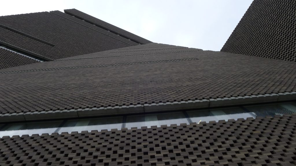
A blockbuster it may be, but when I first saw the designs for the Tate Modern extension, I had to suppress a scream, because on paper it just looked a mess hurled up with no thought to the surrounding environment. With time I have come to love the new bold statement. Starting with the outside, the ziggurat shape is not some fevered dream of the architects as much as it a realistic use of the space available; there are still turbines generating electricity within the old power station and over-priced, under-nice flats have sprung up around the Tate Modern, making the new structure seem like “like a defensive watchtower” in the words of Oliver Wainwright. Unusually, the new structure is built of brick, 336,000 of them, demoting glass to mere strips slashing the buildings surface, yet allowing the interior to feel bright and spacious, which is an impressive feat.
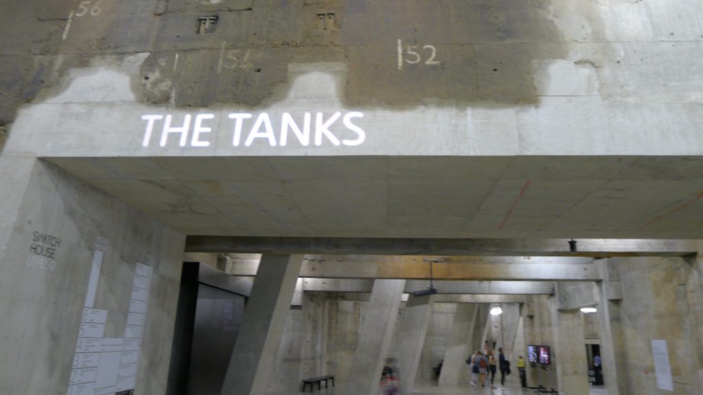
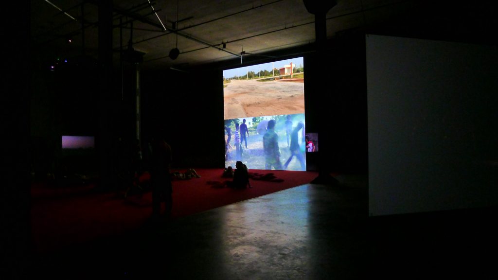
Heading into The Tanks, an underground cavern where oil used to be stored, there is a genuine sense of excitement at what has been accomplished. Being given the gift of grit and industry, the architects have finished the space off as rough-hewn as imaginable. Above one doorway is a set of concrete steps, leading nowhere. The walls are uneven and the concrete seems to have retained scars from its former use, dank stains are everywhere. The Tanks are said to be the world’s first permanent space for video installation and Apichatpong Weerasethakul’s Primitive is nine videos set in Thailand. The videos are not seemingly in order and all play over each other, creating an uneasy viewing experience made somewhat surreal by cushions strewn across the gallery floor. People lay down, some looking up at the ceiling, others switching position to see what’s happening on another screen. Couples are inter-twined and a sense of calm pervades.
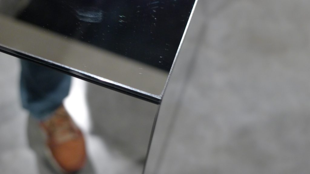
There’s also a massive room filled with interactive art, my favourite being Robert Morris’ Untitled, a series of glass cubes that reflect the room around you, perfect for photography.
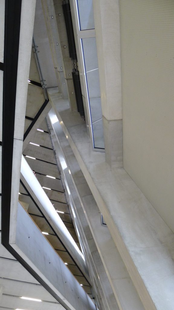
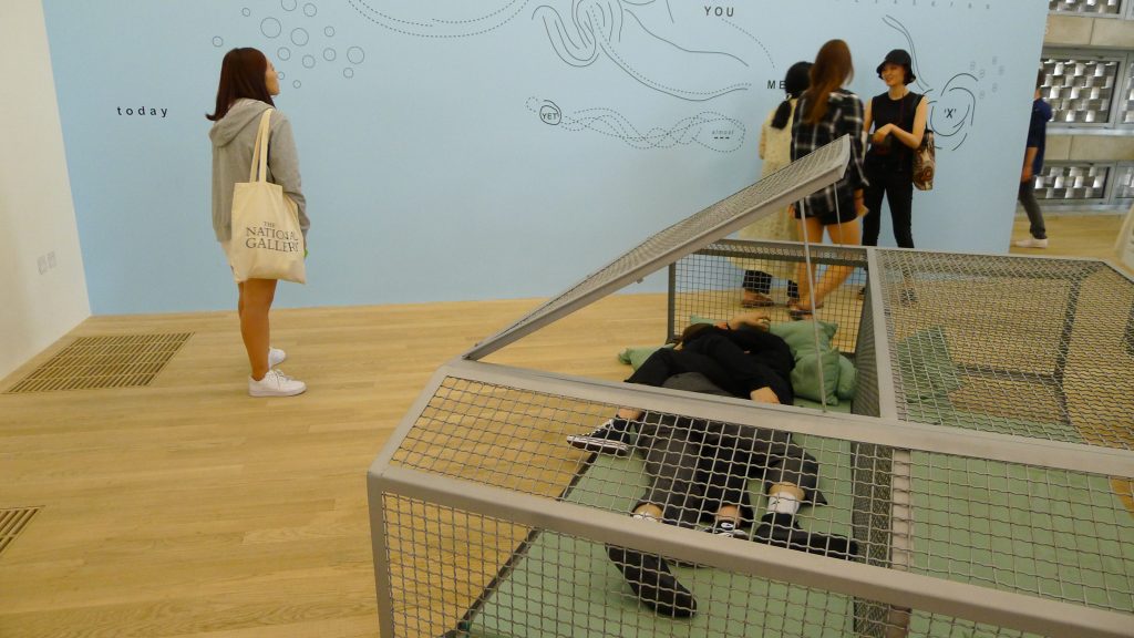
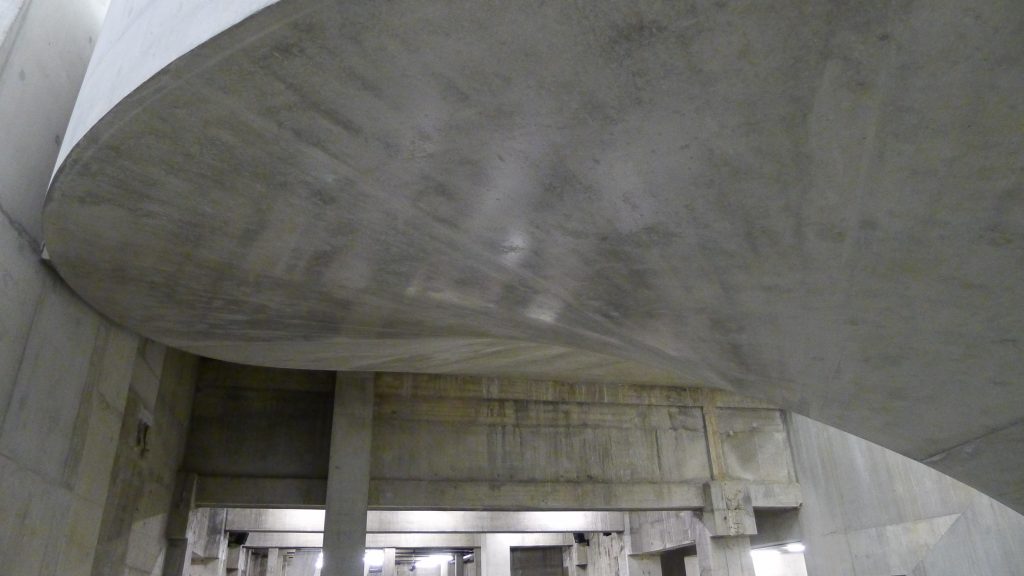
The grand staircase leading up to the new floors is reminiscent of Tate Britain’s new staircase. Where Britain’s staircase is a marble wonder with intricate art deco detailing, Modern’s staircase is of gorgeous twisting concrete. You are led up past one of the endless, excellent, shops to the new collections on levels 2-4 where you can appreciate just how much new space there is. I was surprised to see works that were so immersive; Ricardo Basbaum’s Capsules were little nap stations but one couple also took it upon themselves to start spooning, which is one interpretation of the artist’s intention. But also, they could just not.
What is particularly impressive about the new levels is that the rooms are so vast and open as well as lit from above, so any future re-hangs can take place with maximum flexibility. Coming across a pile of bricks on the floor, I was struck by my mum’s argument that she could have made the art. Carl Andre’s work, not called A pile of bricks, but Equivalent VIII was controversial when the gutter press got involved, but here it is displayed again, looking like a pile of bricks. Is it art? I guess if someone in art calls it art, it is art.
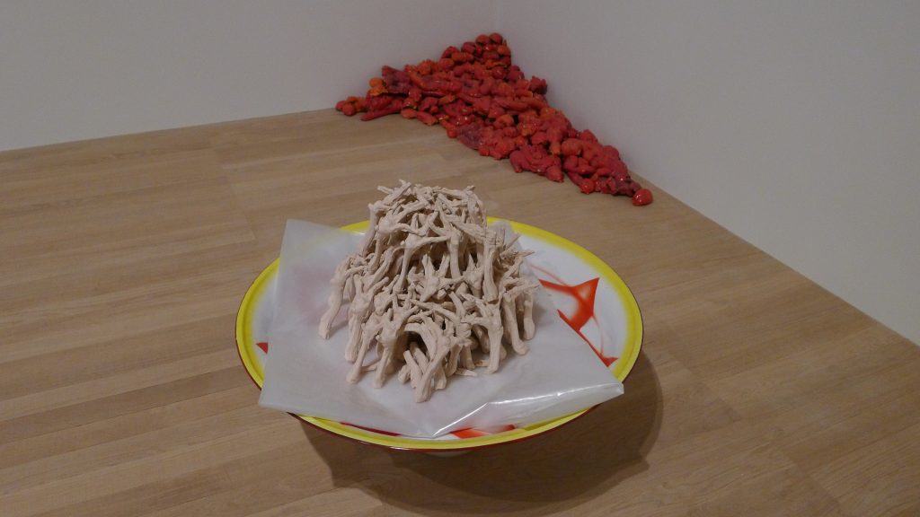
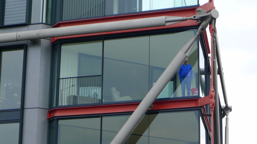
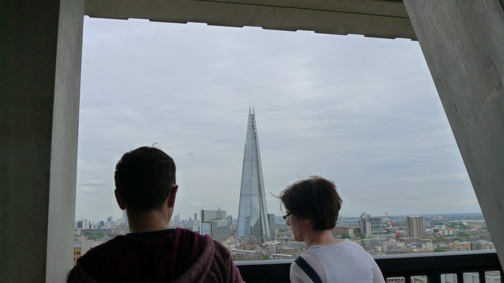
On Level 3, we encounter a load of Chicken Feet by Meschac Gaba, which I must have loved because I took a photo of the artist’s details as well as the picture of the feet. Perhaps I just enjoyed the colour. But if my tone suggests I am losing interest in the art, it’s just down to fatigue. I always get gallery fatigue about 90 minutes into my excursions. With that in mind, it’s straight up to Level 10 for the 360-degree viewing platform. A great new addition to every Londoner’s favourite past-time of looking out over the city, the viewing platform offers outstanding views of St Paul’s, the existing Tate Modern tower and excitingly, right into the glossy flats opposite. I spot a man looking dolefully at a bucket in the sharp corner of his living room. He has become art, and is paying a fortune for it. Luckily for the rest of us, visiting the Tate is free and the new extension is a great new addition to London’s cultural life.

